The United Nations Sendai Framework for Disaster Risk Reduction identifies disaster losses as a proportion of GDP to be a key metric for tracking progress on disaster risk reduction.1 This makes obvious sense because as the global economy grows there is more “stuff” exposed and vulnerable to being damaged. The sort of changes to the built environment that you see in the photos of Shanghai above have occurred all over the world as the global economy has more than doubled in size since just the 1990s.
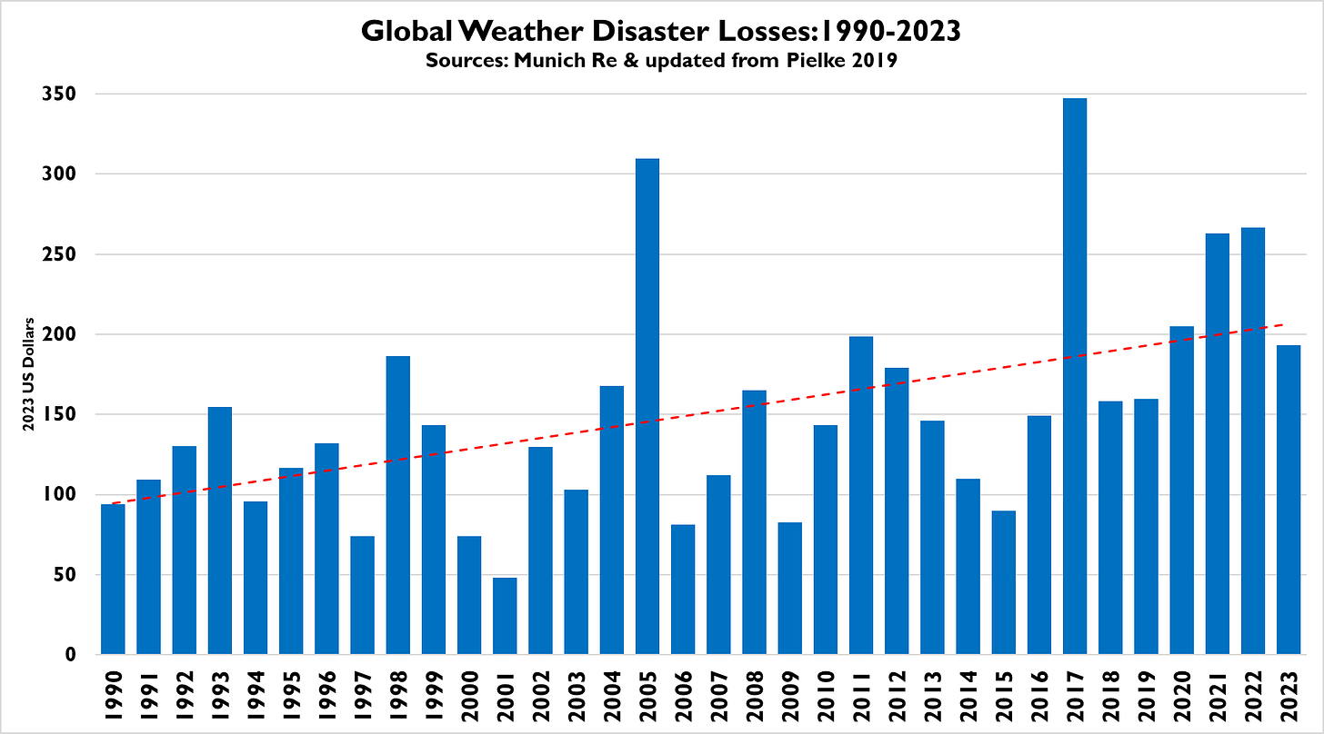
That means that looking just at total disaster losses, even adjusting for inflation, paints an incomplete picture of trends — maybe even misleading. With economic growth, we should expect losses to increase over time, as you can see in the figure below showing total weather disaster losses since 1990, updated based on the 2023 data update from Munich Re earlier this week.2
Some look at the trends in the graph above and conclude: Aha! Climate change! Because disasters occur at the intersection of extreme events and society, it will always be appropriate to look directly at weather and climate data to detect trends in weather and climate. Don’t use economic data — That should be obvious.
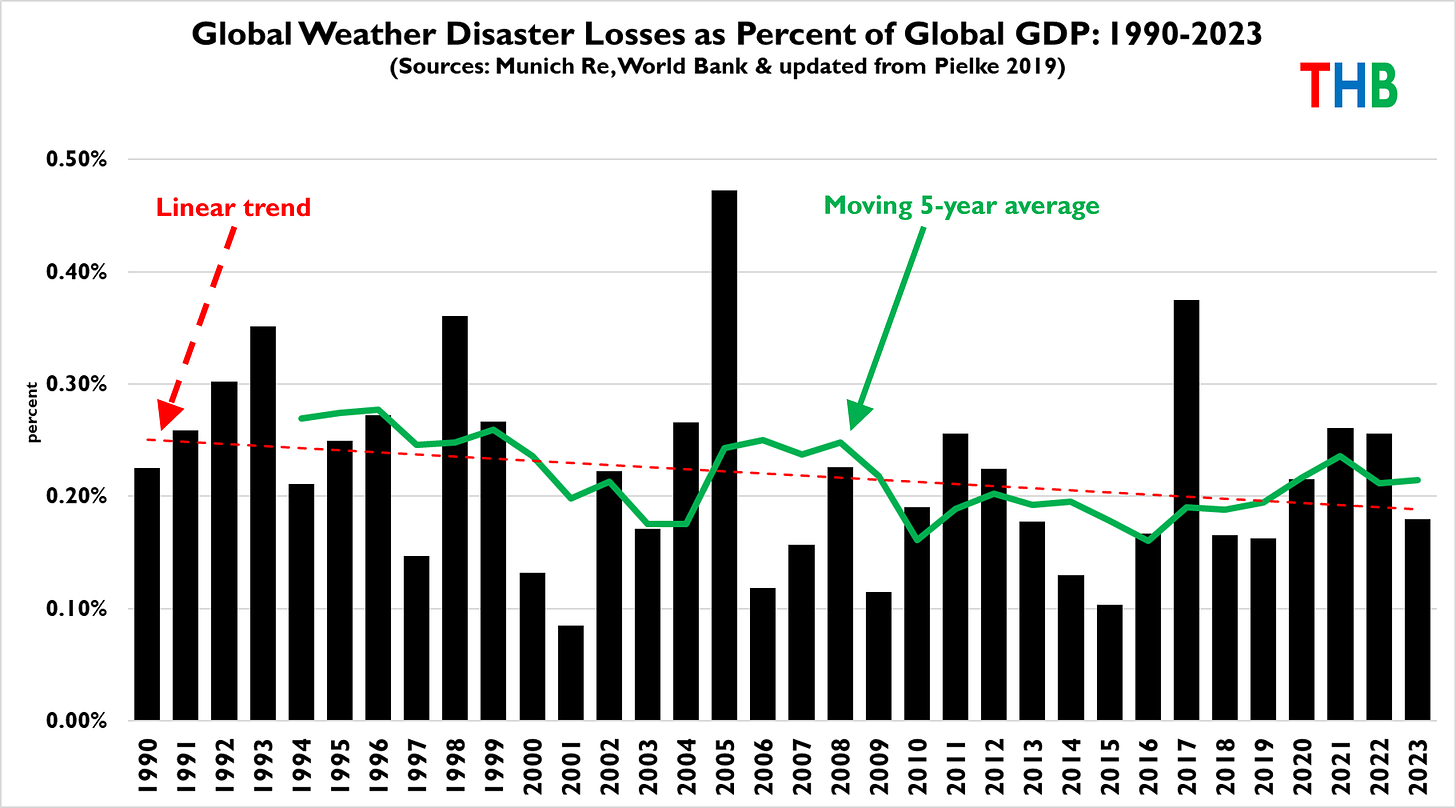
To get a better sense of trends in disaster losses it is necessary to normalize disaster losses by taking into account changes in exposure and vulnerability. The UN Sendai Framework recommends looking at disaster losses as a proportion of GDP as a method of normalization.3 The graph below shows the same data shown above, but this time as a proportion of global GDP.
Since 1990, the toll of disasters as a proportion of the global economy has gone down from about 0.25% of GDP to less than 0.20%. That is good news and indicates progress with respect to the goals of the Sendai Framework.
Some quick questions and answers.
Can we conclude from this data that climate change is making disasters more frequent or costly? No
Can we conclude from this trend that climate change signals are not detectable in trends in various extreme events? No
What can we say about climate change by looking at this graph? Nothing
What about those journalists and campaigners who claim that economic losses from disasters indicate the detection and attribution of trends in extreme weather? They are wrong
How would we know if disasters are becoming more costly due to climate change? Follow this methodology
Finally, to end the week, here is a bonus graph related to the NOAA “billion dollar disaster” dataset. The figure shows inflation-adjusted annual US GDP versus annual counts of “billion dollar disasters” (from a version of the NOAA data I downloaded in late 2023). As I’ve often said, this is not rocket science.
Here are the data sources for the global disaster update:
Munich Re (updated from Pielke 2019)
World Bank (GDP)
OMB (to adjust to 2023 USD)
Pielke 2019 (methodology and background)
Thanks for reading! I welcome comments, critique and suggestions. If you are reading this in the US east of the Rockies, stay warm this weekend.
The other two Sendai Framework metrics of progress are deaths and people affected, as a proportion of overall population.
According to Munich Re, 2023 was below average in terms of overall weather and climate-related total losses and insured losses. The most significant events of 2023 were earthquakes, which killed more than 63,000 people.
GDP adjustments are common in many contexts. There are far more sophisticated and granular approaches to normalization. I reviewed this literature here and updated it more recently here.


At 79, I have lost my ability to be surprised, Roger.
FWIW I don't think wildfires should be lumped in with floods and other "weather related" disasters. Weather is only one of many things that affect wildfires and there are human forces working to reduce damage in real time with varying success due to various factors. Imagine a hurricane-slowing technology.. or a real-time flood reduction technology. They don't exist. Wildfires are a different kettle of fish. IMHO.