This is Part 2 … for Part 1, head here
Last November, I had the privilege of speaking at UCLA in the Jacob Marschak Interdisciplinary Colloquium on Mathematics in the Behavioral Sciences. My lecture was titled “Mathiness where Science Meets Politics,” and I provided a tour of research that I’ve been involved in over the past 30 years that has — for better or worse — made its way into highly contested settings where science, policy and politics collide.
This post is the second of two, and presents ten proposed principles for the effective use of math in policy research. Perhaps these principles will form the basis for a future paper, who knows — after completing this post I think it could easily be a book. You are invited to share your own examples in the comments at the bottom —it is a target-rich environment! I welcome your reactions, suggestions and critique.
Use real-world variables
Policy research is more useful and relevant when it focuses on real-world variables. It is very easy for us researchers to study proxies for real-world variables or dimensionless indices in search of statistical or scientific significance. However, translating the practical meaning of those variables back to the real-world may not be particularly straightforward or even possible. .
Consider how the Intergovernmental Panel on Climate Change (IPCC) confused itself over a study of measurements of hurricanes, mistakenly converting trends in measurements of hurricanes to making claims about trends in hurricanes (which I documented here and here). The urge to use proxies for the thing-we-really-want-to-say-something-about often arises because the real-world variable does not give the results we want or expect. If you want to study hurricanes, study hurricanes. If hurricanes don’t give the results you want, that says something important — say it and don’t go looking for work-arounds.
Be exceedingly precise about definitions
An anecdote from a classic policy paper will suffice:
[O]nce an objective standard is set, attaining that criteria may become its own end. An allegation about Grandma Moses illustrates the case. It is reported that Grandma Moses told an art dealer who purchased one of her early paintings from a gallery exhibit that there were 15 more like it at home. He bought them sight unseen and paid the same price for each as he paid for the one on display. Arriving at her home the next day to pick them up, the dealer found Grandma Moses with a saw, cutting one of her paintings in half. It seems that when she got home she found she had only 14 paintings and, not wanting to fall back on her agreement, she was correcting the discrepancy.
Use commonly understood, conventional definitions
In 2013 a paper was published in PNAS with the title, “Homogeneous record of Atlantic hurricane surge threat since 1923.” The paper generated predictable reporting, such as this from Scientific American, “Katrina-Like Storm Surges Could Become Norm: The combined effects of sea level rise and more powerful storms could cause a 10-fold increase in the occurrence rate of extreme storm surges.”
One problem — the paper didn’t actually study hurricane storm surges. It studied storm surges regardless of their cause (hurricane surges actually had not increased). As the lead author of the PNAS paper admitted:
There’s one obvious caveat about the new results: not every hurricane creates a storm surge, since they don’t always hit land. And not every storm surge is caused by a hurricane. “The storm surge index,” Grinsted said, “is sensitive to strong winter storms as well.” And it’s quite possible, he said, that the intensity of a given storm surge could be made greater or less by the angle at which a hurricane hits land.
Surges aren’t, in short, a perfect stand-in for hurricanes, but Grinsted said that they’re pretty good. In cases where they could do so, the team has lined up hurricane data with surge data, and, he said, “there are clear correlations. So while our paper might not explain everything, it is still useful."
Caveat lector.
Use multiple methods and multiple independent sources of data
I have long argued that climate change is real and important, but that it is exceedingly difficult if not impossible today to detect a signal of human-caused climate change in time series of economic losses from disasters. One reason I have very high confidence in this claim is the number and diversity of studies that have been performed looking at the issue.
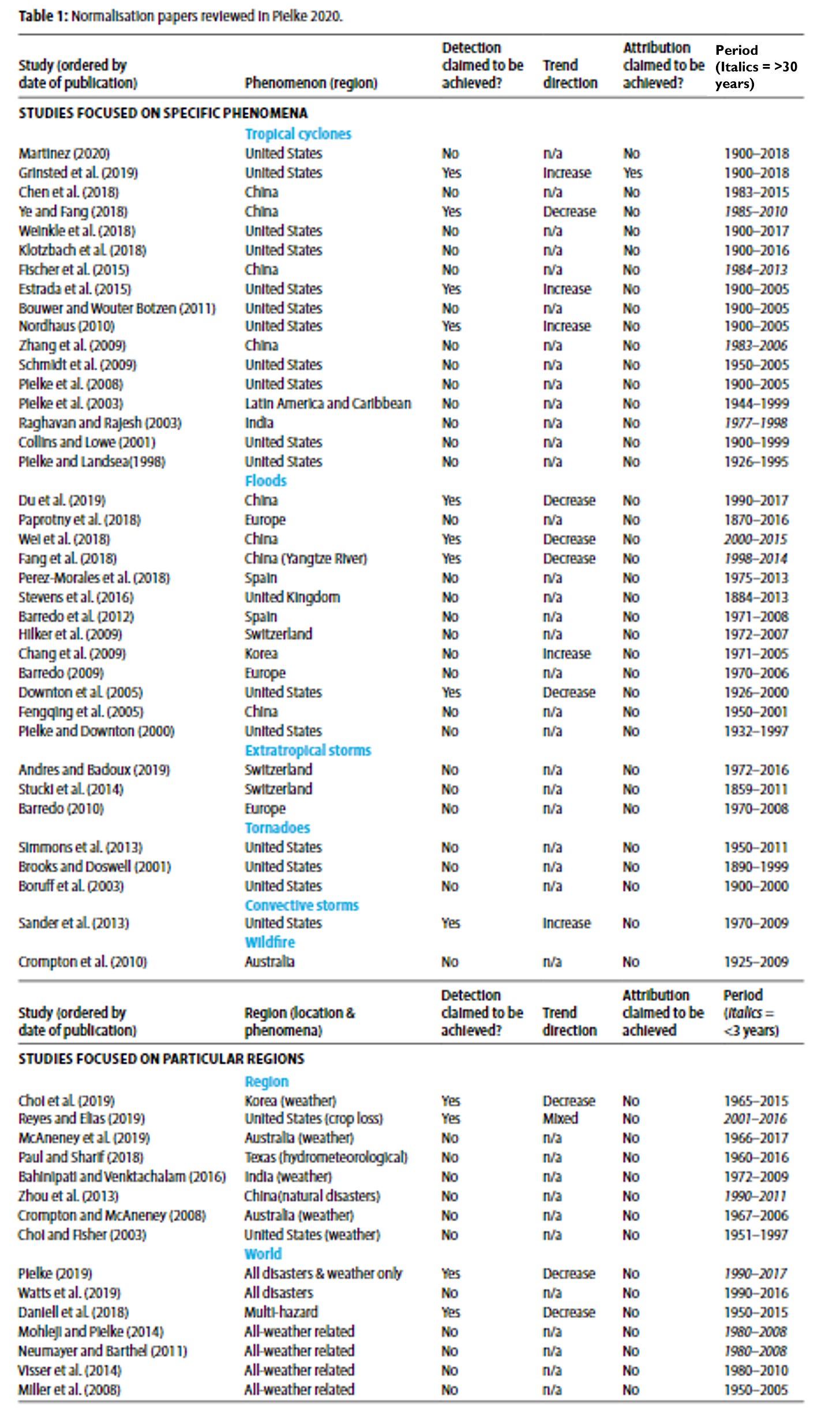
The figure below summarizes the results of more than 60 different papers, written by hundreds of researchers from countries around the world, using different methods and different datasets. The resulting consensus is exceptionally strong.
You can read more about the review in the table above at this THB post.
Beware intentional or unintentional cherry picking
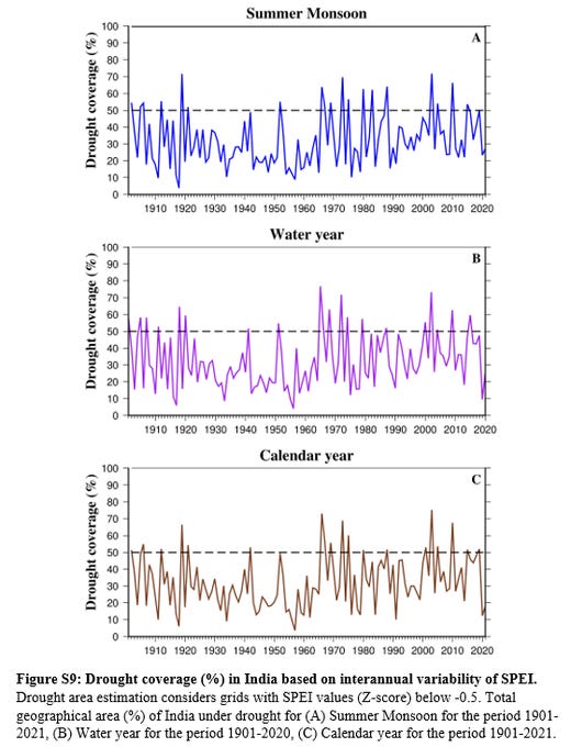
The image above is in an interesting new paper out this week providing an atlas of Indian drought from 1901 to 2020. The three panels of the figure show different ways to measure the areal extent of drought across India — using just the monsoon season (top), the water year (June-May, middle) and the calendar year (bottom).
There is little indication of a trend in the data across the three measures over the entire time series. But my eyeballs say that if the time series were to be started in the mid-1950s or so, an upward trend would result.
The length of the time series we use in our research may be dictated by data availability or other factors, but it important to realize that the world did not start when your dataset begins and that choices in what time periods to study sometimes matter immensely.
Replication of analyses used in policy is as important as novel studies
Some of you may recall the case of “Growth in a Time of Debt” by Professor Carmen Reinhart and the former chief economist of the International Monetary Fund, Ken Rogoff. Here is the BBC from April, 2013:
This week, economists have been astonished to find that a famous academic paper often used to make the case for austerity cuts contains major errors. Another surprise is that the mistakes, by two eminent Harvard professors, were spotted by a student doing his homework. . . student Thomas Herndon [was given] graduate class an assignment - pick an economics paper and see if you can replicate the results. . .
No matter how he tried, he just couldn't replicate Reinhart and Rogoff's results. . . After some correspondence, Reinhart and Rogoff provided Thomas with the actual working spreadsheet they'd used to obtain their results. "Everyone says seeing is believing, but I almost didn't believe my eyes," he says.
. . . he'd spotted a basic error in the spreadsheet. The Harvard professors had accidentally only included 15 of the 20 countries under analysis in their key calculation (of average GDP growth in countries with high public debt).
Australia, Austria, Belgium, Canada and Denmark were missing.
Oops.
Media friendly does not mean good research
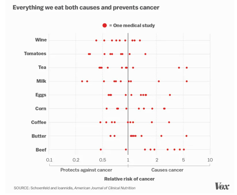
The figure above, created by Vox from Schoenfeld and Ioannidis 2013 shows the findings of dozens of medical studies on the effects of various food and drink on risks of cancer. Each individual study might generate many headlines. Media friendliness doesn’t mean we know anything.
The practical significance of a result is inversely proportional to the complexity required to reach the result
I don’t know who said it, but there is an old adage that says if you torture data enough, it will confess. Simple methods, shared data, easily replicable, with clear meaning are always going to be preferrable in policy settings to complex methods, unavailable data, impossibility of replication with unclear meaning.
Both the natural and social sciences are guilty of unnecessary complexity in research design and implementation. A good example is the so-called “social cost of carbon” which employs mind-numbingly complex methods to arrive at results that can really be whatever you’d like them to be, simply by tinkering with assumptions and methods.
Empirical, policy-relevant research may or may not be relevant to theory-building in the social sciences
This one probably explains why I am a policy scholar and not a political scientist. Here is how we described this issue in a recent (and underappreciated!) paper on policy research and sports governance:
. . . a common if sometimes off-target criticism of theorists is that they may stay locked within their ivory towers distanced from the reality of practice—a perspective expressed by Warren Buffet in his 1984 description of how academics viewed his approach to investing, “it may be all right in practice, but it will never work in theory” (Buffet, 1984, n.p.). A contrasting, also sometimes off-target characterisation holds that practitioners remain busy in practice with little time (or concern) to access or interpret theory. To the extent that such characterisations are accurate, they reflect the real challenges of integrating theory and practice (McNie, 2007). Importantly, this challenge is not solely about the practitioners’ attitudes towards or use of theory but also the extent to which practical problems are appropriately informed via academic inquiry. . .
We recommend thinking of theories and methods as providing intellectual tools that allow the analyst to construct a conceptual map of a particular policy context (cf., Pielke, 2004). A map is practically useful to the extent that it supports decision making that empowers travel from one place to another, in order to work towards the achievement of desired outcomes. Such outcomes may be specific to a particular policy or more general, such as the furtherance of democratic practices. Geographical maps are created in different ways with different levels of precision and accuracy, and for different purposes. Maps of policy contexts are no different. Cairney and Weible (2017) recommend three useful functions of the contemporary policy sciences: (a) to broaden the spectrum of choice and the people involved, (b) to show how choice takes place in complex contexts, and (c) to embrace basic and applied science. We find this orientation and the metaphor of a conceptual map to be useful in understanding the roles of theory and methods in sport-related research focused on empowering decision making in practical settings.
Question narratives and narrative supporting research
If research seems just a little too convenient, ask some questions. Some of you long-time readers will be familiar with the work I did with Ross Tucker and Erik Boye to expose fundamental errors in the research used to ban Caster Semenya from track and field competition.
The research performed by the International Federation of Athletics Associations (IAAF) claimed that athletes like her had an unfair advantage only in the exact events that she competed in … Rrrrrrrright.
That seemed a little too convenient for the IAAF — and it was. We discovered gross errors in their work and the IAAF issued a correction years later. Whatever one thinks about the issues in play, we also should agree that good science should underpin the debate.
Thanks for reading! I hope your 2024 is off to a great start. If you’ve read this far today, you deserve a bonus — Watch out for next Monday here at THB. Fireworks. I appreciate all THB subscribers at whatever level makes sense for you. Your support makes THB possible!


I believe the full quote is "If you torture the data long enough, it will confess to anything." I understand it is attributed to Ronald Coase, "How Should Economists Choose?"
What a great discussion! And I was relieved that your "10" didn't actually include specific mathematical techniques. Whew!
Much of the discussion pertains to how researchers handle data, to which there can be reasonable disagreement. It reminded me of a 2022 PNAS study where they sent the identical database to 73 research groups. No one here will be surprised that there were remarkably different conclusions amongst the groups. A 2013 editorial called it "The Garden of Forked Paths".
www.pnas.org/doi/10.1073/pnas.2203150119