Every so often, I come across a policy analysis that is so quantitatively robust and crystal clear in its presentation, that it clarifies how I think. Today is one of those days.
In a just-released report the Economic Innovation Group — a non-partisan think tank in Washington, DC — focuses on the rising share of government transfers in the incomes of Americans, discusses the negative implications of this important long-term trend, and what might be done to turn things around.
In this post, I summarize the report and explain its importance for thinking about the nation’s economic growth imperative. I do encourage you to read the whole report.
Let’s start with the report’s definition of “government transfers” — These are what are usually called entitlement programs of the federal government, the largest of which are Social Security and Medicare for older Americans, and Medicaid for those with low incomes. The growth in these programs since 1970, along with several other entitlement programs, is shown in the figure below.
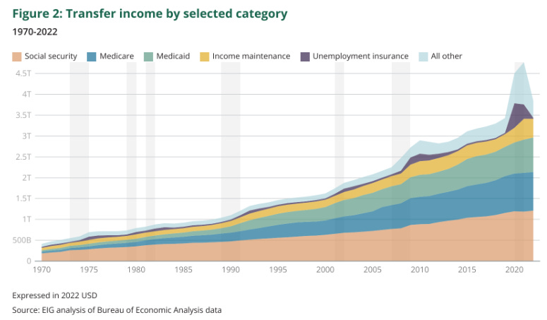
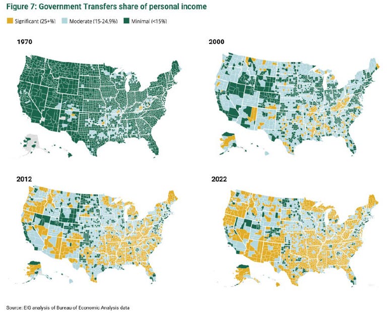
The increases in government transfers over the past 55 years has resulted in an increasing share of people and places that depend upon transfers as a “significant” component of their personal income. The figure below — showing transfers by U.S. county at four different points in time — is striking. (EIG offers an interactive map here where you can zoom into individual counties.)
The main reason for this trend of increasing government transfers is the aging of the U.S. population:
“In the end, aging plays the starring role”
The trend is not primarily due to the expansion of social programs:
“The expansion of the social safety net—new programs, increased generosity, and increased coverage—explains only a small portion of the overall rise in the transfer share.”
There is considerable variation across communities, but aging represents a national-level dynamic:
“[T]he 65 and over share of the population and the poverty rate are not strongly correlated with each other, with a correlation coefficient of -0.014.
This suggests that each is useful for explaining transfer levels across the map, but that they apply in different places, and only one—aging—is good at explaining nationwide changes in transfers over time.
In part, this is because many deeply economically distressed and high-transfer areas—the heart of Appalachia, for example—have been distressed and transfer-dependent for a long time, while aging has been a much more dynamic phenomenon that has also affected more places.”
Let’s reemphasize this point:
“[T]he nation’s poor population is growing nowhere near as quickly as its elderly population. Income maintenance programs constitute small portions of both total transfer spending and growth in transfer spending over time.”1
“[T]he 65 and over share of the population rose as much in the 10 years from 2010 to 2020 as it did in the 50 years from 1960 to 2010.”
When it comes to government income transfers, and their long-term increases, the U.S. faces demographic challenges that in many places are exacerbated and compounded by challenges arising from a lack of economic opportunity. Let’s get specific.
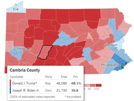
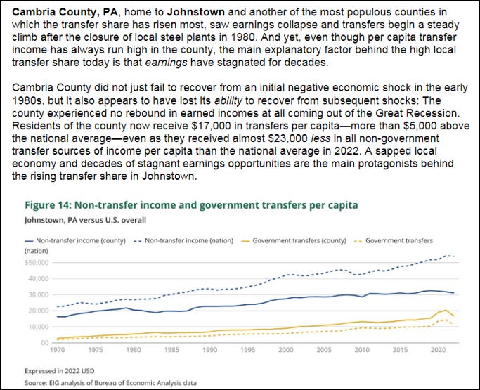
The EIG provides a number of county-level cases and contrasts. Here, I’ll focus on Cambria County, Pennsylvania, one of the places where government transfers have increased the most as a proportion of income.2 The EIG discussion of Cambria County can be seen below.
The EIG explains the resulting lock-in of economic inopportunity:
“High transfer shares combined with low earnings, however, show that a location is subsisting—not that it is thriving.
Such communities risk being trapped in low-level economic equilibriums, and other communities risk being dragged down with them by a range of demographic and economic headwinds. Reversing the transfer share will only be possible by reigniting the opportunity to earn by other means across a much greater portion of the nation’s map. If the Great “Transfer”-mation is to rewind, more people in more places must have the chance to earn well.”
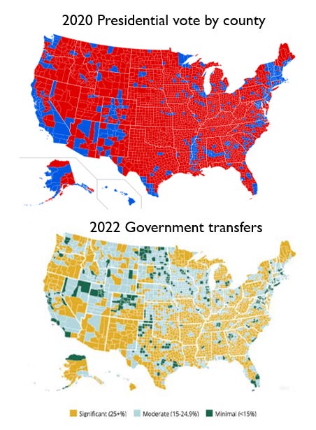
The EIG report does not venture into national politics, but I will. The figure below shows that Cambria County, PA was Trump +37 in the 2020 presidential election.
Before continuing with Cambria County, let me summarize the EIG discussion of why the increasing government transfers matter. EIG explains:
“Put simply, is a high and rising transfer share bad?
The answer is yes, unequivocally. It is bad for what it signals about the economic health of American communities, and it is bad for the fiscal health of the country.
Across huge swathes of the American map, aging has pushed transfers higher while local economic struggles have suppressed growth in other earnings. The result is a reshaping of how communities derive their livelihood—and a fading importance of work and productive activity in generating local incomes.”
Our traditional politics would suggest that to try to boost GDP growth and reduce reliance on government transfers, those on the political right will emphasize cutting government spending on transfers and those on the political left will emphasize raising taxes. EIG cautions that neither approach alone can work — and even with both, more needs to be done:
The country is on a collision course with politically fraught trade-offs. Raising revenues through significantly increased taxes could choke off the very economic activity that finances transfers. Dramatically cutting spending on programs and benefits would unravel parts of the safety net that dignify life in the United States. Tax hikes and entitlement reform are also not enough to solve the problem, either alone or together. Both options must be part of the solution—but not the only part.
What else needs to occur? Greater economic growth:
Faster economic growth is essential to regaining the path back to fiscal health. Investments in research and innovation, an expansive and better designed immigration policy, tax and regulatory policies that foster economic dynamism and participation in the workforce—these and other parts of a growth agenda represent the ideal way to reduce dependence on transfers, by boosting incomes earned from work and investing.
I would hypothesize that there is some degree of correlation between those places that have seen “significant” government transfers and higher Trump shares of the 2020 vote (you can eyeball the figure below). The reason for that hypothesis is that many communities with “significant” government transfers are — as explained above — “subsisting” but not “thriving.”3 In contrast, many communities that are “thriving” have “moderate” or “minimal” government transfers.
As Democrats have increasingly become the party of the educated, wealthy elite, they become identified — rightly or wrongly — as those who bear responsibility for the underlying reasons for those left behind, as the make-up of the U.S. and global economies have shifted. Trump’s populist MAGA appeal taps into this vein, but ironically, offers nothing in the way of sensible policy to “foster economic dynamism.” Kamala Harris apparently understands this, making an “opportunity economy” central to her rhetoric. But the Harris campaign as well suffers from a lack of sensible policy to “foster economic dynamism.”
That leaves us with vibes and partisan politics. Not great for the nation, but also for us policy scholars!
“The nation’s working age population is projected to grow by 6 million between now and 2040, while the over-65 population will swell by 20 million.”
Whatever the outcome of the next election — in Congress as well — these issues are not going away. In fact, give demographic projections they will likely get worse in the absence of effective action.
The United States is going to have to again take seriously the importance of policies underlying improved economic growth. These policies are not going to be simple slogans and necessarily will draw from thinking on the right and on the left. To be effective they will necessitate compromise and pragmatism. That is a big ask for 2025, but the alternatives are much worse.
The EIG reports concludes:
Not since the aftermath of World War II has the country been forced to confront such a troubling fiscal situation. In recent years the federal debt has returned to those all-time highs as a share of GDP—only it has happened through the normal course of business rather than the exigencies of war. The country now runs historically large deficits at every point in the business cycle.
In the immediate post-war period, favorable demographics could be counted on to grow the economy back to fiscal sustainability. No such tailwind exists today. That is why, to truly address the underlying challenge, a growth agenda must include a heavy focus on making it easier to start and sustain families. Demographic vitality and economic vitality go hand in hand.
If there is a silver lining, it is that the rapid aging of the U.S. population is, at least relative to the same trend in other advanced economies, a new phenomenon. By reinvigorating the productive capacity and demographic health of the United States, it is still possible to prevent the country from becoming an ever more dependent one—but only if we get started now.
For further reading:
Burgess, M. G., Langendorf, R. E., Moyer, J. D., Dancer, A., Hughes, B. B., & Tilman, D. (2023). Multidecadal dynamics project slow 21st-century economic growth and income convergence. Communications Earth & Environment, 4(1), 220.
Chetty, R., Dobbie, W. S., Goldman, B., Porter, S., & Yang, C. (2024). Changing opportunity: Sociological mechanisms underlying growing class gaps and shrinking race gaps in economic mobility (No. w32697). National Bureau of Economic Research.
Delventhal, M. J., Fernández-Villaverde, J., & Guner, N. (2021). Demographic transitions across time and space (No. w29480). National Bureau of Economic Research.
Grossmann, M., & Hopkins, D. A. (2024). Polarized by Degrees. Cambridge University Press.
Vlandas, T. (2023). From Gerontocracy to Gerontonomia: The Politics of Economic Stagnation in Ageing Democracies. The Political Quarterly, 94(3), 452-461.
Thanks for reading! I request that you refrain from vibes and partisan politics in the comments. There are plenty of places to cheer on your favorite candidate or disparage the one you don’t like. THB is not one of those places. I’ll consequently moderate the comments more closely than usual. In contrast, I invite discussion and debate of pragmatic policy options that would have the effect of boosting U.S. growth. What would we want to see from the next Congress and signed into law by the next president? THB is reader supported — Please join the ranks of THB subscribers and those who are able to pay to support independent research and analysis!
Even more detail: “[T]he 65 and over share of the population and the poverty rate are not strongly correlated with each other, with a correlation coefficient of -0.014.
This suggests that each is useful for explaining transfer levels across the map, but that they apply in different places, and only one—aging—is good at explaining nationwide changes in transfers over time.
In part, this is because many deeply economically distressed and high-transfer areas—the heart of Appalachia, for example—have been distressed and transfer-dependent for a long time, while aging has been a much more dynamic phenomenon that has also affected more places.”
Pielke trivia: I was born in a county that abuts Cambria County — Centre County, PA — while my Dad was getting his PhD at Penn State. Centre County was Biden ~+5 in 2020. The differences between Cambria and Centre Counties tells us a lot about American politics in 2024.
I probably don’t need to add that everyone wants to thrive, not subsist, especially when others are thriving.



The WSJ had an article on the EIG report today. They tried to spin it as MAGA versus blue areas based only on how many counties receive 25% of personal income from government payments.
The underlying fallacy is that the population of counties varies widely. Highly populated counties are usually urban areas (Los Angeles County, Cook County, etc.) which vote Democratic and sparsely populated counties are usually rural and vote Democratic. This is ridiculously faulty logic. Counties don't receive social security checks. People do.
Roger - consider comparing how many social security checks go to Boulder county or Denver county versus how many go to Weld county. That would be meaningless because of the huge population differences. That's the fallacy underlying the EIG report.
Another flaw is that Social Security and Medicare are programs that workers pay into over their entire career. That is entirely different than a welfare check or food stamps which are need based.
Another flaw is that the report didn't consider the amount of government money flowing into the higher education complex and government contractors. How much personal income in places like Northern Virginia is from government jobs?
While the report is sober and the conclusions reasonable, I struggle with their presenting government outlays in dollars rather than as a percentage of GDP. It's worth noting that U.S. GDP was about $1 Trillion for 1970 and $26 Trillion for 2022. Transfer income from 1970 to 2022 increased by a factor of about ten, or much less than the growth in GDP.