SERIES: Making Sense of Trends in Disaster Losses
Part 2: Normalized disaster losses in Europe 1995 to 2019
This post is the second is a series that will help you to make better sense of disasters that we see across our planet. In 2022, watching disasters unfold in real-time via ubiquitous high-definition videos and via social media brings their impacts home in a way that was never possible in years and decades past. But even with today’s technology that brings incredible imagery of disasters from around the world to our screens, understanding disasters in the content of changes in society and in climate over long periods is difficult, even for experts.
In this post I’ll continue to illustrate an approach to understanding disasters over time called “normalization” which seeks to estimate the economic and other human impacts of extreme events of the past, were they to occur under today’s societal conditions — including things like today’s population, levels of economic development and modern infrastructure. If you haven’t yet read Part 1 on this series (link), you may wish to have a look before proceeding.
In this post I illustrate a very simple approach to normalization, and in process present an new analysis you won’t see anywhere else. Specifically, I assess economic losses from disasters that have occurred in Europe in recent decades in the context of a growing European economy.
The first data that we need to perform a normalization analysis are disaster losses. The disaster data shown in the graph below were published by Scope Ratings GmbH last year for 1980 to 2019, drawing on work of the European Environment Agency and are expressed in inflation-adjusted 2020 Euros.
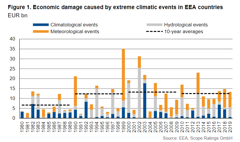
The data above includes losses from extreme events classified as climatological (climate), meteorological (weather) and hydrological (water). You can see that losses range from a low in 1991 of just a few billion Euros to 35 billion Euros in 1999. Europe almost always sees much lower economic losses from disasters than does the United States, as Europe has no hurricanes and few tornadoes. From 1990 there is no overall trend up or down.
Over time however, economies typically grow. That means more infrastructure, more property, more wealth — in short, more stuff exposed to the potential for loss from extreme events. So we should expect, all else equal, economic losses from climate, weather and water will tend to increase over time as we place more stuff in harm’s way. That is why just looking at economic losses over time can be misleading, not only do climate, weather and water extremes vary and change, so too does our communities (see Part 1 for discussion).
A very simple (but also very powerful) approach to considering societal change in long-term disaster losses is to look at those losses as a fraction of the overall economy, typically measured as GDP. In fact, the U.N. Sendai Framework for Disaster Risk Reduction uses disaster losses as a proportion of GDP as one of its measures of progress.
Here I use GDP data for Europe from Eurostat (the EEA 27 plus the UK and Turkey). You can see European disaster losses normalized by GDP for 1995 to 2019 in the graph below.
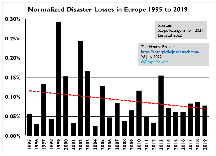
Over the 25-year period 1995 to 2019, Europe’s disaster losses as a proportion of GDP decreased significantly, by almost half. While this doesn’t make the disasters we experience today any less awful, over the longer term, this trend is of course very good news and one we’d like to see continue.
One way we can gain some confidence that the downward trend in normalized losses is real is to have a look at a parallel database which tracks the number of disasters in Europe. The graph below shows data from the EM-DAT database of the Belgian Center for Research on the Epidemiology of Disasters. That data shows that the number of disasters in Europe decreased from 2001 to 2021.
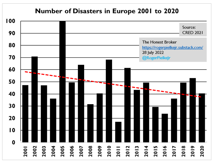
So both the number of disasters and their cost decreased over the periods tracked in each of the two datasets. That should add to our confidence that the trend accurately reflects a declining economic impact of disasters so far this century.
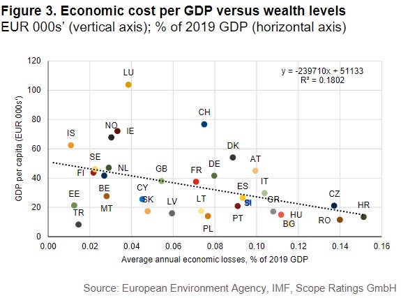
There is another important consistency check we can do. The figure below shows the average annual economic losses for each European country plotted against its per capita GDP, from the analysis of Scope Ratings GmbH. You can see that the wealthier a country is, the lower its annual economic losses as a proportion of GDP. Within Europe, wealthier means less relative loss.
The data above offer a further confirmation that as Europe has gotten wealthier, disaster losses as a proportion of its GDP have decreased. What we are observing in Europe is not a surprise, as it is part of a broader global trend of decreasing economic impacts of disasters. Whether those trends continue is up to us, and how we build, prepare and respond to extreme events around the world in the face of a variable and changing climate.
Part 3 in this series will take a close look at a more technically sophisticated approach to normalization using the example of U.S. hurricane losses.
Paying subscribers to The Honest Broker receive subscriber-only posts, regular pointers to recommended readings, occasional direct emails with PDFs of my books and paywalled writings and the opportunity to participate in conversations on the site. I am also looking for additional ways to add value to those who see fit to support my work.
There are three subscription models:
1. The annual subscription: $80 annually
2. The standard monthly subscription: $8 monthly - which gives you a bit more flexibility.
3. Founders club: $500 annually, or another amount at your discretion - for those who have the ability or interest to support my work at a higher level.


Climate experts speak of increased frequency and intensity of these events. How does it correlate with economic losses?
Just a quick comment, without having read the posting yet. One graph calls GDP per capita "wealth." The correct interpretation of per cap GDP is "standard of living." Wealth is something else, it's the value of assets owned -- e.g., home equity, stocks, and other property.