
The Green Quadrant
A new way to visual progress (or not) towards climate targets


1974 — That was the only year since 1965 in which global consumption of fossil fuels decreased while global energy consumption increased. In order to meet targets for deep decarbonization, the consumption of fossil fuels will have to decrease as overall energy consumption increases.
I am always looking for new ways to illustrate the magnitude of the challenge of achieving targets for deep decarbonization. An important step in solving a problem is understanding the magnitude of the challenge. In this post I am presenting the notion of the Green Quadrant as an experimental new way (for me at least) of visualizing the challenge.
Reducing fossil fuel consumption by 50% by 2030 — or more technically, the combined total of (a) fossil fuel consumption reductions plus (b) fossil fuel consumption with emissions fully captured and stored — implies a 7.4% annual rate of decline. Similarly, to achieve an 80% reduction by 2050 implies a 5.4% annual rate of decline. These figures are illustrated by the dashed blue line and blue line, respectively in the figure below.
The “Green Quadrant” — highlighted by the green square — denotes the space where fossil fuel consumption decreases while overall energy consumption increases. It is a lonely place. The only data point in the quadrant occurred during the midst of a global fossil fuel energy crisis combined with increases in nuclear power and even greater increases in hydro power.
Within the Green Quadrant the area shaded in red shows the range of global energy consumption growth rates of the SSP scenarios featured in the most recent reports of the Intergovernmental Panel on Climate Change (from -0.3% to 2.1% from 2020 to 2050, Median = 1.0%, and from 2000-2021 global energy consumption increased at a rate of 2.1% per year).
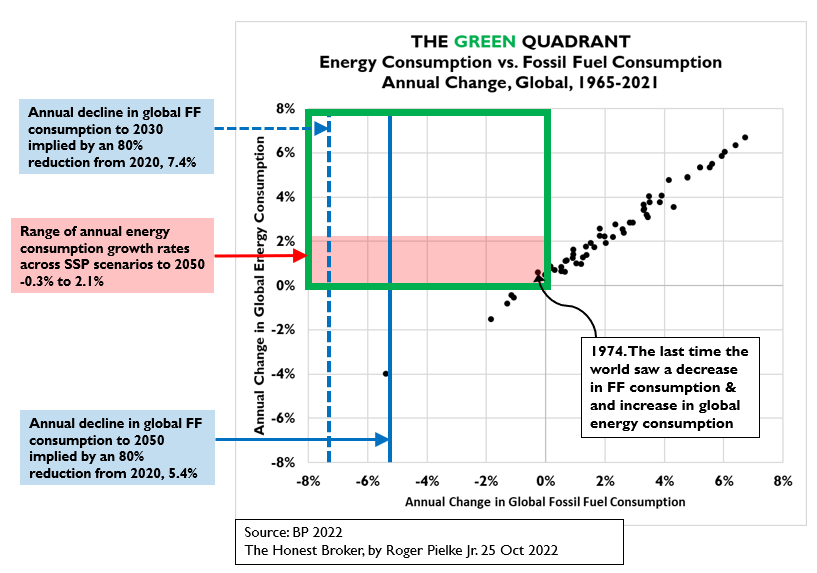
Reducing fossil fuel consumption by 80% by 2050 means that future data points on this figure — representing annual fossil fuel and total energy consumption — necessarily must fall on or to the left of the solid blue line. As you can see, since 1965 the relationship between overall energy consumption and that of fossil fuels is essentially linear, which makes sense as the world still depends on fossil fuels for about 85% of total energy consumption. So far, there is little or even no indication of movement towards the Green Quadrant, much less its far reaches.
I welcome your feedback. Does this graph make sense? Is it clear? When might we expect to see the Green Quadrant filled with data indicating accelerated progress towards climate targets? Does this graph vindicate those calling for intentional degrowth or energy consumption restrictions in order to hit climate targets?
All comments welcomed.
The graph makes sense to us nerds who take the time to think it through. Pick your percentage of the general population that falls into this category................I pick ..01%.
I think targeting filling the green quadrant with data because of fears of the impacts of climate change is a fools errand. Increased global energy consumption will continue and is a measure of success in addressing society's needs. See the work of Mark Mills.
Those advocating intentional degrowth or energy consumption restrictions because of the fears of climate change are..................pick your noun ..............I choose "fascists".
There is overwhelming evidence that society is robust enough to deal with whatever climate change can through at us by adapting. If I am wrong about this......so be it! But I am not wrong about this.
If the purpose of this post is to demonstrate that Net Zero targets are ludicrous and that we need to move on to develop rational energy policies, you have succeeded.
It’s a fantastic graph; perfectly clear to me. It shows how unrealistic the net zero by 2050 goal is.