Pielke's Weekly Memo #14
Slides from and discussion of my "Climate Misinformation" talk today
Today I gave a talk via Zoom titled “Climate Misinformation.” The talk was organized by the National Association of Scholars and I am appreciative of the opportunity to share my work and engage in discussion with people whose politics may not be the same as my own. We experts need to do more of that in my opinion.
Below, after the jump paid subscribers can download a copy of my complete slide deck from today’s talk and read some additional commentary from me about some highlights.
Before that, and on the subject of “climate misinformation,” I have two quick anecdotes. The first did not make the talk but the second one did.
First, earlier this week The Washington Post published an article on a new paper on U.S. precipitation trends with the following headline: “Study finds climate change is bringing more intense rains to U.S.” And the Post explained that the new paper “tied the results to climate change.” Seems pretty clear, right?
Well here is what the new paper actually says (emphasis added):
Although we examine precipitation trends during a time of increasing greenhouse gas concentrations, and find similarities with greenhouse gas-forced model projections, our analysis is insufficient to directly attribute observed changes to ongoing anthropogenic climate change.
You won’t find a clearer case of misinformation in the major media.
Well, hold on. Maybe you can. This next one made today’s talk, because it is just irresistible.
Frequent readers will know that I have often expressed amazement that the mainstream media has steadfastly refused to share with their viewers and readers a time series of U.S. hurricane landfalls — That is, until now!
Here is my oft-shared timeseries of U.S. landfalls that you’ve likely seen me share here and on Twitter, and which I update after every hurricane season, based on a paper I co-authored in 2018.

Consider my surprise when this exact figure appeared recently on CNN.
Bill Nye (“The Science Guy”) had a print out of the figure, which he waved around as an example of “misleading” science. Someone had added a title to the graph which said — accurately — “No Increase in Hurricane Frequency” referring specifically to the landfall time series. “The Science Guy” took a Sharpie (irony noted) and crossed out “No” and emphasized the “Increase.” He then claimed falsely that the figure refers only to “cherrypicked” East Coast landfalls. Have a look at the screenshot below.
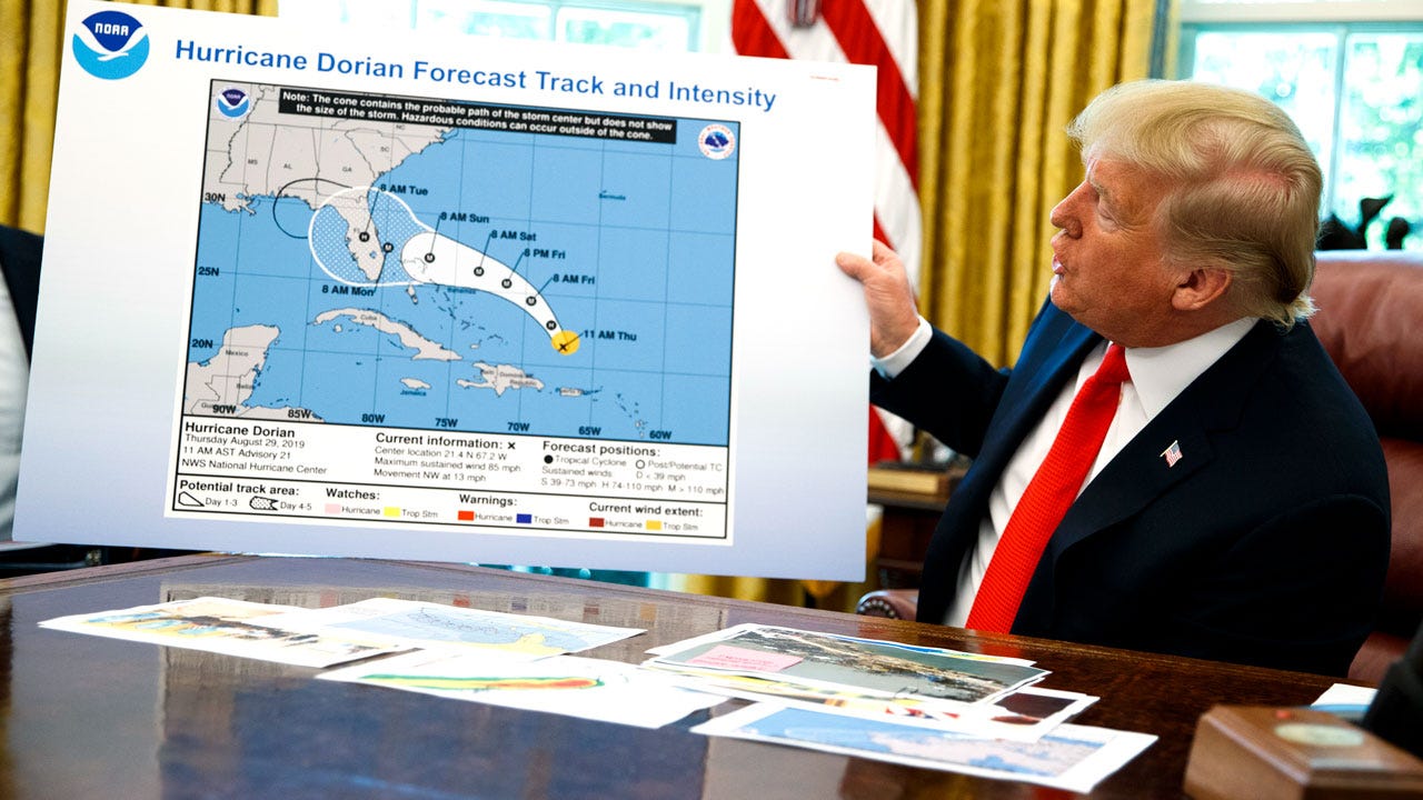
I don’t know what it is with hurricanes and Sharpies, but once again you won’t find a clearer case of climate misinformation. Nye’s whole interview is quite cringy — he says climate change is caused by people breathing and a few other odd things. But I guess that is what happens when an area of science becomes a political symbol.
Lucky me, eh?
OK, let’s take the jump where you can download my slides and I’ll offer some additional comments on the subject. Please look for the full video next week.


